Wednesday, 17 December 2014

Ancillary - Lighting and Photography planing


Lighting and Photography Planing


For the equipment, we are going to be using a DSLR. The same DSLR we will be using for filming. We are going to be using a DSLR because of its ability to capture RAW images. This will help us correct: Colours, lighting and exposure in post.


We will be using a tripod along with the camera for added stability. The benefits of using a tripod is that we can level our shots so that they have no angle. It will also add as a level of protection for the camera because it is fastened into the tripod.


We are going to using natural light because we will be taking pictures outside. We will try and shoot our pictures during mid day so that the natural light around us is brightest. Because we are shooting in RAW we will be able to change the lighting levels of each picture in the editing stage.


When we are taking pictures we need to take into account where in the shot the text will go. To help us manage this we can use the rule of thirds. Most cameras allow you to have a grid display up on the screen. By using this we can align up where the characters in the shot should be and and if there will be space to put the text.
If we say the text will go on the top line then we can put actors and props along the bottom line and the sides.

Monday, 15 December 2014

Costume/Props/Make-up Planning (Ancillary)

In regards to costume we will be using the same clothing that the main actor will be wearing during the filming. This is due to the link of the film and poster. To have the actor wearing the same clothes it allows the audience to instantly recognise the main character from the clothes that he wears.

With props we may use a piece of paper with the words "bucket list" written at the top of it. This obviously directly links to our film and would not have any other words written on it. Having this as our poster will easily grab the audiences attention and will easily convey what our film is all about and who is acting and filming it.


The poster above is an example of the type of clothing that is similar to what we may use for our ancillary poster. It is quite ordinary clothing for someone around our age. Though this may not be the best poster it does give us some idea as to how a basic poster can be rather effective at getting the image of the film across.  

Actor Planning for Ancillary

We will use our main actor (Liam Hodgson) in our poster. Most films use their main actor to not only promote the film but also to promote the actor. Usually films will use main character as the main character is usually a well known actor so this will promote the film further as people will recognise the actor and look into the film. As Liam is not a well known actor we will just use him to stay relevant to the film.

Film posters are used to tell the audience roughly what the film is about, so we were thinking that we should put on of the bucket list ideas.

Task 2


http://www.emaze.com/?emazehome
This website is for presenting. I think this website is a good website to use in the future as it is simple and easy to learn but the outcome is very good and looks professional. It is very similar to Prezi so we would already know the basics.

http://apps.pixlr.com/editor/
This is a website for photo editing. This is a good website as it is very simple to use but it doesn't go in as much detail as photoshop, so if we want just a quick job on a photo we would use this site but if we want a professional job then we would use photoshop.

Ancillary task schedule

Due to a delay in filming for various reasons we had to delay the creation of our ancillary task to around the beginning of February.

Draw Poster Audience Feedback


I handed people in my class a copy of the draw up film poster and asked them to say a positive and a negative thing about it.


Nick Baldwin: The posters main headings fading into the distance is a nice touch. You might run into trouble when trying to picture a scene with the Sun out and a few clouds because of the season.

Josh Barnes: The location which is draw looks very nice. The poster is missing the names of key actors and institutions. A little bit of work will need to be done using Photoshop to blend in the titles with the clouds.

Danny O'Brien: Neat looking poster. Could try and add more of the characters to the poster.

Jake Hemming: I like how the titles are blended in with the clouds. This will require some photoshop work but overall the poster seems not overly complicated which will be easy for your group to meet deadlines.

Ancillary Location


For our posters and other ancillary we are going to use our main location for filming so the posters stay relevant to the film. We are hoping to get a picture of someone going down the road and we are hoping to get a clear road so the best time will be to shoot at night when the road is clear but if this is not possible then we can always take photos inside the house.


This is the road we want to take photos as this road is more quite that the others so we would be able to use the road with out cars getting in the way.

PhotoPeach & Emaze


PhotoPeach allows users to upload pictures to put into a slide show. The Order you upload the photos is the order they are put into the slideshow.


They then choose what music they would like to have in their slide show. They can choose from some music that is already on the website, from Youtube or from their own collection.

Emaze is very similar to Prezi. You create slides with text, images and/or video. And then is allows the viewer to go through the presentation in a graphical way. A benefit of using Emaze is that it supports .ppt files. So converting any Microsoft Powerpoint files into Emaze is supported.

The Bucket List (Film Poster ) using PhotoPeach

The Bucket List (Film Poster) on PhotoPeach

Drawn Film Poster


Wednesday, 10 December 2014

Mood Board

Our mood board is more focusing on the niche audience side of our film. Short films aren't very popular and definitely aren't mainstream so we have gone for more of a hipster mood board. It includes songs and films that are popular amongst the hipster community but also includes dramas and comedies to stay relevant to our film. We added Dumb and Dumber and Downton Abbey because although they are mainstream they stay relevant to our film as one is a comedy and one is a drama.

Monday, 8 December 2014

Research 2

This film is a comedy/drama. It has the generic conventions for both genres. For example the second half of the film is where theres more comedy and is in a higher key lighting, typical of a comedy film.


Whereas in the beginning of the film, where most of the drama takes place it is in low key lighting. This is typical of the drama convention.


  In comedies it is typical to have some sort of duo, as the storyline will follow the relationship of the two main characters. This is counter typical of a drama as in dramas it focuses on one character and their story.

Tuesday, 2 December 2014

Inspiration for our film poster

We had a few inspirations for our poster idea. The main inspiration was from the movie "The Bucket List". We choose this film as it is very close to our one, so we chose this poster to base it on.
Our poster features two friends, although this is not our finished poster we would like to have two people doing on the things on their bucket list on the poster.
Our finished poster will be something similar to this. We will have at least one person doing an actual task on the bucket list, our final film will be in high key lighting as it is meant to be a happier ending and we want to portray this in our poster. We will have all our actors on the front as there won't be many. The title is crucial and to get the right font is important. We will be taking samples of text from other comedies/dramas. The 'Bucket List' font isn't what we want, we would prefer something more comical.
Although are film isn't a comedy the style of the front cover is appealing and we think it would be good to follow these 

Preliminary Inspiration

Preliminary Inspiration


For the preliminary film poster i created i got the idea from a short film i have seen. The film (pictured right) is called "Orange Drive". The film has only one camera angle. The camera is mounted on to the front of the car throughout the film.

The two shot used in this film allows the audience to see: The characters, clothes they are wearing, props they are holding and their facial expressions. Because of the amount of information given off by this particular shot i chose to do a similar premise on the preliminary film poster.


There are some similarities between our film and this film such as:

  • Both films follow the life of a boy.
  • Low budget
  • Small Cast


Monday, 1 December 2014

Preliminary Photoshop Ancillary


Professional Poster

The purpose of an advert of a film in a magazine is to promote the film and the actor, most magazine adverts will have a large picture of the actor. In this case its Daniel Craig featuring in Quantum of Solace.
It is also common to advertise other films, but these films are usually smaller and they have the bigger film taking up the front cover.


The magazine cover tries to cram as much information onto it and likes to get the consumers interest with exclusive interviews and exclusive content such as posters etc.

We chose this cover as an example as we want over cover to look similar as we will have our main actor taking up the majority if the page


Typical conventions of film posters


From many of the posters I have seen both professional and student there seem to be similar conventions for them all.

  • The largest text is usually the title of the film. Standing out so that the audience will be attracted to not only the poster but the title first.
  • The main character is usually in the centre and the main image on the poster this is supposed to allow the audience to recognise straight away who the main character in the film will be.
  • Posters also usually have the names of the actors in the film as well as who directed it and the name of the company that produced and financed the film.
  • There also tends to be some sort of slogan that usually relates to the film sometimes like the film poster above there is a fact that says a bit either about the director or main actor.
  • Other examples are below:


Student Ancillary

"Unbalanced" Film Poster Analysis


The film poster features: the release date of the short film, the institution that is making the film, the actors and the title of the film.

The film poster is dark which hints to the audience that the film can have a scary genre such as Horror or Gore. This is a common convention of a film poster. This is because the poster wants to give as much information about a film without revealing its narrative. The poster is in black and white as well. Black and white gives a quite subdued look to the character.

The character on the poster looks rather unkept. The character has greasy looking hair and is unshaven. This can means that the characters class may be low/working class.


The Avengers film analysis

The Avengers Poster Analysis

These posters are made to promote the film. This Poster is typical for an action film as the CGI in the background suggest its going to be a CGI heavy film and a lot of fighting.
The poster has the main protagonist on the front which is typical of an action film, the film is based on these heroes so they want to promote these heroes as much as they can.


The text is very professional and custom made, it is designed to fit the background and the genre.
"The" is cleverly edited into the A of "Avengers"


Student analysis of a student film

The Omega Film Poster Analysis


This poster has many conventions of a typical horror/theory. It has dark colours with bright red text suggesting blood or death. The dark colours suggest its not a happy film and the way the hand is laid out, it looks like the person is dead.


The slogan under the film suggest its a horror, as it includes hell and by "The End" this mostly likely means death. The text look like blood splattered onto the poster.

Overall this poster looks very professional, as it includes the dates, the actors and the text is very relevant. 


Ancillary task research


  • This persons ancillary task of a magazine cover has them directly in the centre. The reason to why she's probably in the centre is because she is the main character of the film.
  • The largest text on the magazine is the title which is expected. The title is also No.1 Films which the person is trying to link with their film being rather good.
  • To attract an audience the person has decided to put a box circle with "WIN" in large capital letters. By doing this the person hopes that a potential audience will be attracted to the prospect of being able to win a trip to Florida.
  • The background of this magazine cover being brown with a bit of yellow allows the other parts of the cover to stand out more such as the supposed main character and the interview section of the cover.

Friday, 28 November 2014

Script

Scene 1, Waking up:

Lewis: *Starts to wake up*

Parent: LEWIS! Wake up!

Lewis: Okay, Okay, OKAY! *progressively louder*

Parent: LEWIS

Lewis: Urgh *mumbles*

Narration: This is how i wake up every morning. *Gets interrupted*

Parent: You're going to be late!

Narration: ...Every morning.

Scene 1, Getting ready:

Narration: Im in my last year at school now. *Puts on school blazer*
I've always hated that blazer, in fact, school in general... *Trousers on & Shoes*
Every day(Monday to Friday) i will wake up like this, get ready and go to school.

Scene 2, Montage 1(Journey to School):
               
Narration: [Sound Bridge] The walk to school is quite nice actually. *Headphones go in*
Only one more day till the weekend which is nice! *Music starts*

Scene 2, Montage 1(At School): 

Narration: School can be decent sometimes. *Paper gets thrown at him* But most of the times its   Shi....[Cut]


Scene 3, Home by desk:


Parent: Lewis, Dinner is ready.

Lewis: *Goes down stairs and brings it up to the desk* Thanks (parent)!

Parent: *Stands by door* Lewis we have just got a letter through the door. You better be getting good grades in your exams next month. Its important!

Lewis: Yes, yes, yes i know. *Continues on with his games, etc*

Scene 3, Blog: 

Narration: One day i stumbled across a post on this website. So i thought 'Oh why not'.
After reading that post i decided to create my own bucket list. It took me ages to make a list of things i wanted to do. It took my mind off of the pressures of school actually.

Parent: Lewis!

Narration: Well for a bit.

Scene 4, The Bucket List: 

Instructor: Right Lewis, Raise the clutch and pull away.

Lewis: *Proceeds to stall* Right one more try.

Instructor: Raise it slowly, lets begin.

Lewis: *Pulls away perfectly*

Scene 4, GYM: 

Narration: Now i'm not the strongest kid in the world. I mostly just go on runs.

*Small montage of weights increasing*

Narration: But i've definitely gotten stronger. (But not that strong) *Camera points at biggest weights in the gym*.

Scene 4, Blog Post: 

Narration: I decided to make a post on how i've made my self more happy. I have completed my bucket list now. I still go out and try things i've never done before but now i just do them for fun.

Scene 5, Fishing/ Home: *One month later*

Narration: I love fishing now. I go every friday afternoon. Very peaceful. I have just finished my exams and are dreading the results.

Narration: Once i got back home i saw on the table a brown envelope addressed to me. They were my results....


Target audience

Location Research

Location Research

Location research is  arguably the most important stage in the pre production period of making a film. The importances of having a good location is that some narratives need certain locations in order to provide a realistic experience for the audience. When choosing locations the location scouts take into account several factors including: Budget of the film, Availability of amenities(Hotels, Electrical outputs), availability of light and the feasibility of getting to the location.

At each location you have to get permission to use the land from the owner. Sometimes they might just let you on their land, but most times you will have to pay to use it.

Local weather reports HAVE to be taken into account. If you're going to a notoriously rainy country to film then this can cause issues if you are filming picturesque scenes.


Thursday, 27 November 2014

Film Poster Analysis - The Purge

The Purge Film Poster

The poster I will be analysing is a poster from the 2013 film “The Purge”. The film is a horror film and is about how in a fictional place in America, all crime is legal for one night every year.

When you first see the poster you will be drawn immediately to the mask and the writing “The Purge”. They are the main parts of the poster because they provide anchor which draws people’s eyes to the poster. The white text stands out from the dark background and allows the audience to immediately tell what film the poster is showing. Having an easy to standout text allows the audience to get key information from the poster, even if they have just scanned the poster quickly. This allows posters to be put on the sides of buses and other mediums where viewers have a small time to view the poster. The typography of the title is: Bold, non-italics, san serif and is spaced out. All of these features of the text make it easier to read at short and especially at longer distances. Also the meaning of “Purge” is often defined as “To rid of sin, guilt or defilement”. So by having a carefully selected name and including it in the poster in such an easy to read way – the poster can inject information into the viewer’s mind without them really knowing.

The denotation of dark scenes in films (even more so in horror films) is that there is a sense of not knowing what could be in the places where you cannot see. This then leads to more tension being built into scenes. This poster follows the generic convention of a dark background image. This immediately denotes that the film is a horror film.

The picture in the background of a man in mask is displayed. The mask features facial features which are un-natural and this gives the mask the scariness which is shown on the poster. There is also an intertextual link with a popular game “Payday 2” which was released around the same time as “The Purge”. The game features crimes being committed but with a main focus of people using masks. Much like the antagonists in “The Purge”. 

The film poster also includes names of the institutions that have helped produced the film. This acts as advertising towards these institutions. There is also an age rating on the poster which refers to the film. Because this is an american poster it says 17+ viewers. Because of this age rating viewers know the film will contain scenes of: Swearing, Violence and probably gore.

Bruce Lee Played Badminton Too - Textual Analysis

Short Film textual Analysis: Bruce Lee played badminton too


I found this short film from a website that specialises in hosting short films. The film was partially funded by a small grant provided by the Australian Government. The budget was small because most of the relatively small time it took to film the shots and that most of the crew working on the film offered to volunteer their time. The genre of the short is a Drama/comedy which focuses on the struggles of a teenage boy trying to play badminton when the odds are obviously against him.
The audience are introduced immediately to the premise of the short. The main protagonist in the story is shown walking out into a badminton court. This is shown by the use of a wide shot. The character is highlighted by their white clothes which makes a contrast to the dark lighting of the scene. The combination of: Dirty shoes, old equipment and non-stereotypical body makes him look amateurish. This amateurish style links the character to the short film itself (being low budget) and the sporting abilities of the average person. So from the first scene the audience starts to make connections with the protagonist.

The next scene is him waking up in the morning and getting ready for the day. The short film uses a montage of quickly cut clips to shorten the time (Temporal Ellipsis) taken for him to get ready. This convention is common in shorter films and some TV programmes because they don’t have the time to show all of the clips individually. During this montage there is one shot that is longer than the others and this shot is an over the shoulder shot of a calendar building up to an event. This shot then thickens the narrative and foreshadows that the next scenes will be of him training for this event. It also tells us that the narrative will be linear. A linear narrative is conventional in short films because they cannot afford to waste time in developing more complex narratives like in feature films. So by having a linear narrative they can have a narrative which keeps the audience entertained for the full 15-20 minutes. The scene then finishes off with him training in his back garden which continues with the amateur theme of the film.  During this his training an upbeat song plays which creates a sense of euphoria among the audience. This can be imitating the feelings that the protagonist is going through and helps the audience to understand the passion he has for badminton.  

In the next scene the protagonist is having breakfast with his family. During this scene the family is conversing normally until they get onto the subject of the boys Badminton training. At this point the film breaks into disequilibrium. The father says to the boy ‘Stop wearing my old tennis gear… that uniform should be for a champion’. These strong words are exacerbated by the lack of any background noise and an extended period of time where nothing visually happens on screen.  This scene is one of the shortest scenes, but is one of the most pivotal scenes in the short.
 
The next clip is off the boy practicing badminton in his garden. The scene is different from other scenes because this time a subtle background music track is added. This changes the usual mood of a scene from a euphoric mood to a relaxed/calm mood. This connotes subconsciously to the audience that the narrative is thicker than just having a boy playing badminton. By introducing a romance side into this short the narrative become multi-layered. This allows the audience to reconcile with the boy and become more attached to him (Draws the audience’s attention). A Point Of View shot then confirms this as the boy is peaking over his fence and is looking at a girl next door to him. This shot allows the audience to be put into the boy’s perspective. The importance of this scene is that the boy has stopped doing something he is passionate about, to look at a girl. It can also mean that the boy is possibly insecure about playing badminton and that maybe he should prioritise other things like getting a girlfriend higher than Badminton.

The film finishes with the Badminton tournament. This is the only part of the film where binary opposites is apparent (The various opponents and the protagonist). Because of the connection the audience has with the protagonist (from the multi-layered narrative). The close ups on the protagonists show his anxiousness towards the first match. This creates tension in a scene and keeps the audience on their seat. A montage then begins showing the protagonist beating his opponents till he gets to the final, it also shows the boy’s father looking proud by cheering on him on. His last opponent is the girl that he saw while looking over his fence earlier. The same background music starts to play and the boy then loses the final match. But even though the boy loses the disequilibrium is settled as the audience subconsciously knows that the boy didn’t mean to lose he was just in a trance – because the same thing happened in an earlier scene.


The short film follows various conventions of short films such as Todorovs theory. It also contains theories from Dramas and Romance films such as: something bad happening in the narrative then the problem being resolved by the end. From this short film I have learned that for my short film we need to have a strong script and good actors to pull off a strong narrative. Also during the editing stage adding parallel sound to certain scenes can add emphasis. Sound can also be used to bridge two scenes from different parts of a film in order to connect them – for example when the boy was peaking over the fence and in the last scene when he was playing against the same girl.


Wednesday, 26 November 2014

Equipment

We have chosen to use our own equipment because of the schools lack of cameras. For our main camera we will be using a Nikon D3100. The benefits of this is that we can change the lens on the camera depending on the shot we want. The camera allows us to manually focus during shots in order to get the perfect focus on each shot.


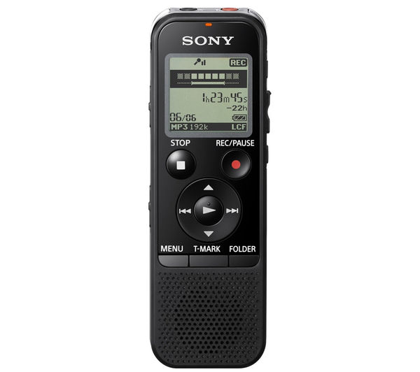
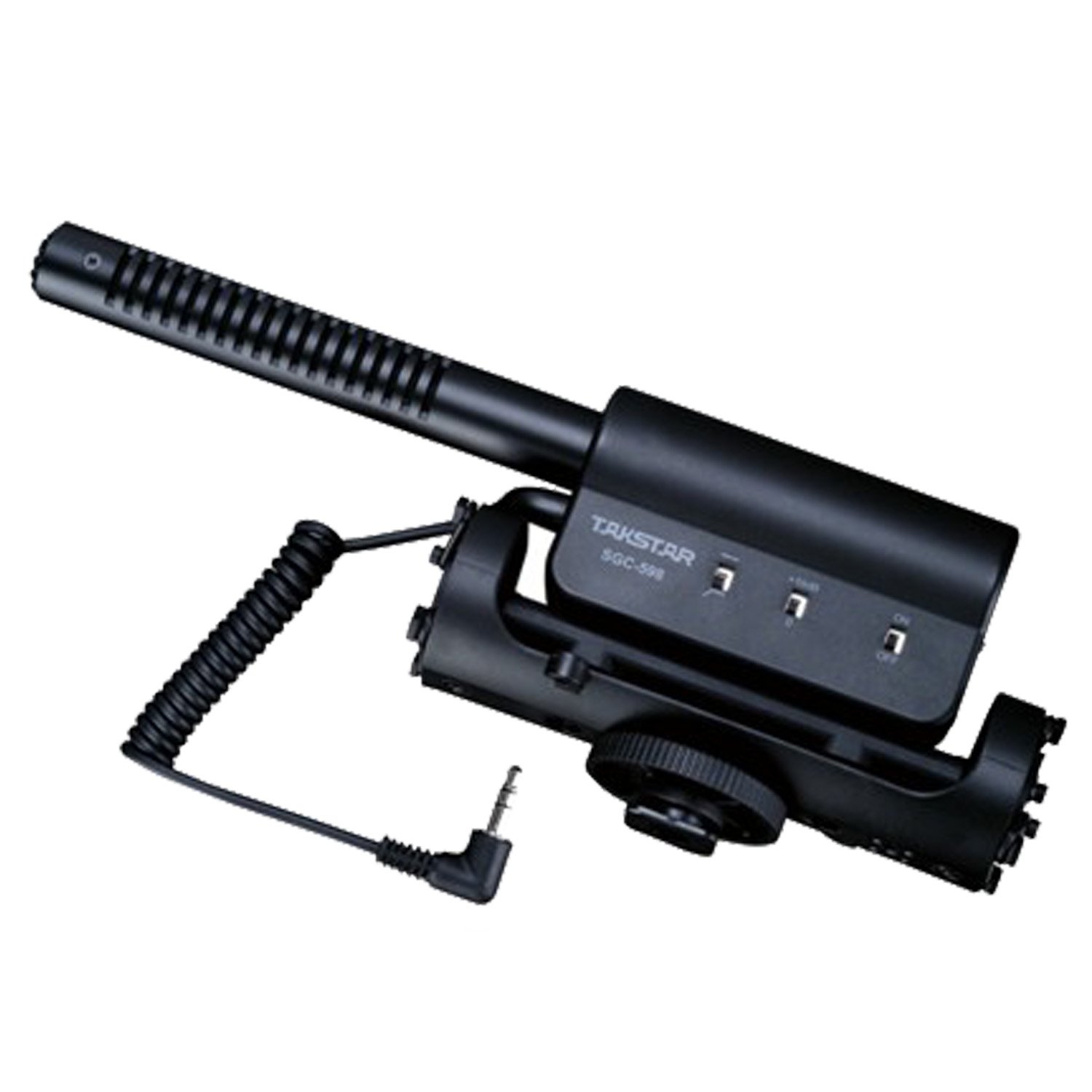
For audio we are going with a standalone setup. We will be using a Sony PX440 audio recorder along with a shotgun Mic. We have chosen to go with a standalone audio setup because the automatic audio gain on the Nikon ruins the audio on shots. So during the editing stage we can sync the audio to the clips to have high quality audio.


We are using a shotgun mic along with a "Dead cat" cover. This will allow us to use the mic in windy conditions. We are using one shotgun mic because it is omnidirectional so we can have two people talking at the same time and still pick both voices up. It just allows us to be more versatile with our shots.


The last piece of equipment we will be using is a GoPro camera. This camera will allow us to get shots where the other camera may be damaged. With a GoPro we can securely mount it to a plethora of different surfaces.